OneGo
A end-to-end design for a multi-ticket eco travel app
App design (Flutter iOS & Android hybrid)
My own co-founded start up

Brief
Scope: 10 months
I wanted to showcase this case study, as its a project I am really proud of and highlights my passion for sustainable design. Following a hackathon organised by UEA called SyncTheCity, me and 3 other co-founders set out to create an eco-friendly multi-ticket travel app, OneGo. OneGo aims to ease travelling around the UK and Europe.
To go into greater detail, OneGo is a door-to-door (D2D) travel booking service that incorporates all tickets needed for the journey on a single app platform, while making it easy to choose the most sustainable green travel option to get to your destination.
I worked very closely with my founder, a developer (front and back-end unicorn) to create a development roadmap. We used Flutter, a hybrid app-building tool for both iOS and Android, as our development tool.
Brief highlights
01. To design a compelling eco friendly multi-ticket travel app
02. To motivate users to go green, adding eco-initiatives, developing an eco points system
03. To provide rewards to users for travelling with OneGo
The Team
Product designer (me), and a full-stack unicorn developer, plus 2 other co-founders who covered business and finance factors
My role: Working closely with the developer/founder, I led every design aspect of the app, bringing the product vision to life.
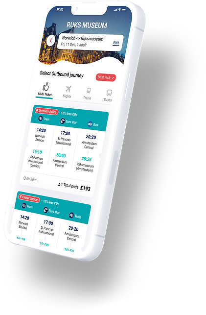
What is OneGo? We offer multiple
journeys all in one ticket
Imagine you want to see your favourite band in Johan Cruijff ArenA in Amsterdam, but you don’t quite know how to get there from your flat in Park Square in Leeds.
So to get to the destination you would have to travel with...
Leeds Metro to Leeds Station
LNER train to London
Eurostar to Amsterdam
Bus to Johan Cruijff ArenA

Now all booked and
stored in one ticket

Review your purchased ticket from Leeds to Amsterdam


Step 01
Go to your ticket wallet
Step 02
See ticket overview
Step 03
Review your 1st journey
Step 04
Select ticket QR code
After each outbound and return trip, you will be rewarded with Eco and Travel perks (depending on the eco-friendliness and length of your journey)

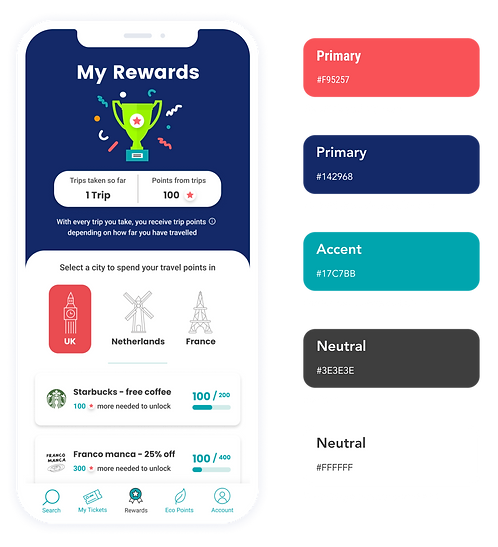
Your Travel Eco Points
Depending on how eco friendly the multi-ticket route you select, you will be gifted Eco points. For example, we transfer the Co2 you save from your eco selected routes into a visual representation (a tree), to gamify and motivate the eco-friendly focus of the app.
Once you save the equivalent of 6 trees, we will let you plant 1 tree from a choice of 3 different tree planting projects across the UK, giving you the satisfaction of real-world eco impact from the comfort of your phone screen.

Your Travel Rewards
Depending on how far you travel on your journey, we will reward you with trip points. E.g. on your travels to Amsterdam, you would be rewarded with trip points which you can spend on rewards. These are based on travel location and home country.
We would offer you perks from local businesses in capital cities, like Amsterdam, London and Paris. We also offer country wide perks from larger stretched businesses. We consistently reward our users for using our product.
Now taking you back to the beginning of the project...
After completing the hackathon, we agreed to give this app idea more thought, and decided to go to the streets and online forums, to see if we could find any demand for our vision. Below shows a general overview of the feedback we found, conducted from online and street surveys.

We concluded 3 general user types for the App
Our user personas gathered from our questionnaires mentioned above as well as in-depth interviews.

How do we stand out from competitors market?
After analysing market demand, and defining our main user groups, we really wanted to understand how we could distinguish ourselves in the market, against our competitors. Below highlights some of our competitive advantages in the travel sector.

Design sprints / process
After defining the core features of our MVP, I started mapping out each sprint. It is important to mention that the duration of each sprint was vastly different from each other, ranging between 5 to 8 weeks. This was because we, as a team, were developing the OneGo product alongside other full time jobs at the time, so finding the time allocation to work on each sprint varied.
My design process through each sprint consisted of: Discovery (design research), Design ideation, User testing, Refine (working through user testing feedback) and Delivery to my developer/co-founder.

-
For the purpose of this case study moving forward, I will be deep diving into what I designed for the Rewards feature. I am really proud of this feature and design around it, so I hope you enjoy reading about it also.
Welcome to the actual case study: The Rewards feature
My Rewards - Case study
I'm focusing this case study on the Rewards section of the app. I believe this section of the app, as well as being 'rewarding' to work on (haha), illustrates several aspects of our product vision, and a keen understanding of what motivates our users.
Rewards Design - ideation 01
Starting with a few basic wireframes, I got a good sense of what I wanted to include for the rewards section. For the MVP, we wanted to include 3 locations where rewards would be offered to our users, which happened to be our main destinations:
-
London
-
Amsterdam
-
Paris

Rewards selection
wireframe

Reward details screen wireframe
Travel points:
-
We wanted to offer our users 'travel points', which they could earn with every OneGo trip.
-
They could collect these points and once they had earned enough they could unlock a variety of rewards.
-
Some of these rewards could be for items such as discounts for local restaurants, and the more premium rewards ranging to museum tickets and paint-balling experiences.
-
We wanted to especially offer Eco-rewards such as 1 free day of bike hire, to our users. We felt this was a compelling addition, both a great way to get around a new city, and a relevant eco-friendly initiative.
Mid Fidelity wireframes:
After a series of ideation, I created some mid-fidelity wireframes which illustrates more complexity around the reward point system.

You can select between the 3 main cities to see what rewards your have
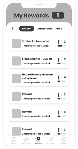
Scrolling state illustrates a more effective use of the page real estate, city selection reduces size to make the rewards the focus.

When you click onto a reward you will be taken to the reward individual product page, where rewards can be unlocked based on trip points.
Unlocking rewards state
In this example the user has completed 2 trips, so they are now eligible to unlock certain rewards.

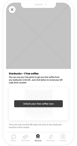
Once the user has earned enough points, they can unlock an offer

Once unlocked, a voucher code (or QR code) is displayed for the users use.
Rewards Design - Ideation 02
What we removed
01:
-
I felt that our users would need more information to fully comprehend the reward section and how they could earn more points. Measuring in just trips taken would not work, as users trips could be different depending on if they where longer or shorter, so I needed to work out a better system of recording points.
02:
-
The reward locations being focused around cities limited what rewards we could offer to our users. We needed to change this.
What we updated
01: Including trip points was a better metric to offer our users, as some bigger trips for example could accrue more points than a shorter trip.
02: I updated the locations of the rewards to be nation-wide rather than focusing on capital cities, to increase the range where the rewards could be spent and offered. This would further entice business chains that had locations around the country.
Previous design
Updated design
01
02

01
02
Ideation 02 / High fidelity designs
Rewards Landing page

Landing page scrolling state


Reward product page
(reward locked)

Reward product page
(reward ready to purphase)
User testing
We tested our mid fidelity designs with 7 users.
3 x users sourced from our original interviews (ages 22 & 35)
4 x users sourced from our co-working space (ages 28 & 48)
User-testing Findings
-
In testing, we found that some of confusion was around the rewards homepage, where we showed the users trips taken and trip points next to it.
-
5/7 users did not find it useful to have the amount of trips next to the trip points, as each trip you got a different amount of trip points, so having them next to each other was not necessary.
-
Based on the testing feedback, we updated the design to display just the total amount of trip points on the rewards homepage. This reduced the cognitive load for the user, as we only display needed information and removed everything else.
Final design recommendations
01: What we removed
-
We removed 'Trips taken so far' from the hero section of rewards screen. This was confusing being next to trip points, as each trip you got a different amount of trip points, so having them next to each other was not necessary and hurt the user experience.
02: Recommendations after user-testing
-
We made the total trip points the main visual focus, larger bold text, and highlighting with colour.
Previous design
01

Updated design
02

Final design: Reward scrolling and helper info
Rewards Landing page

Rewards tier points explained modal
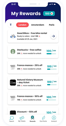
Landing page scrolling state
Final design: Purchasing a reward - QR code


Rewards confirmation modal

Rewards product page
Purchased Rewards product page
(We also offer a code link as well as the QR code)


Offering our users 'Moments of Delight'
I tried to think of ways I could elevate the users experience by bringing in a moments of delight into our users journey.
The perfect opportunity I saw around this was to combine a moment of delight with a success state when the user purchases a reward. The result being that we would show our users a confetti animation celebrate their decision to purchase a reward.
This would offer positive reinforcement and also encourage them to purchase more rewards in the future. I find adding in additions like this is a great way to implement habit building for our users in our app.
Final product prototype
In the end in with a good bit of ideation, exploration and useful user-testing findings we were happy with the final rewards feature.
I feel we were able to detangle any huge issues with the last round of testing. We retested the design with 5 of the 7 original user-testing participants, and thankfully our design decisions were validated with positive feedback all around. With that we were happy to go ahead and start to code this into our OneGo app MVP.
Please see the full prototype of the Rewards feature down below:


After thoughts / Learnings
-
I think one of the main additions we were missing was to include a advanced reward location search, where users could put in a postcode to find rewards that were closer to their location.
-
Regarding future proofing the design, I could have done a better job at the country selection tabs. If we had decided to add more countries to our rewards locations, the main design would need to change quite a bit to fit new additions into the layout. Though important to mention the scrolling state top navigation in the pill format would not need to change, as more options can be added without any change to the design here.
-
It would have been a nice addition to include a eco reward rating or indicator, so users could easily find eco-rewards over the standard rewards listed. This would have been a great phase 2 implementation to include.
Impact
-
One impact that we felt this feature had on our business was that we did want to showcase the design during our investor calls, as we felt that this feature really offered something that not many competitors had. So it helped us further our identify in the market.
-
Sadly we put OneGo on hold, so we never managed to get our MVP out in the Android and iOS market, even though we designed and developed an MVP for it. Though all I can say is that we were lucky we had some initial funding and also make some big partnerships with industry leading companies.