Asylum Links
Refugee Outreach charity
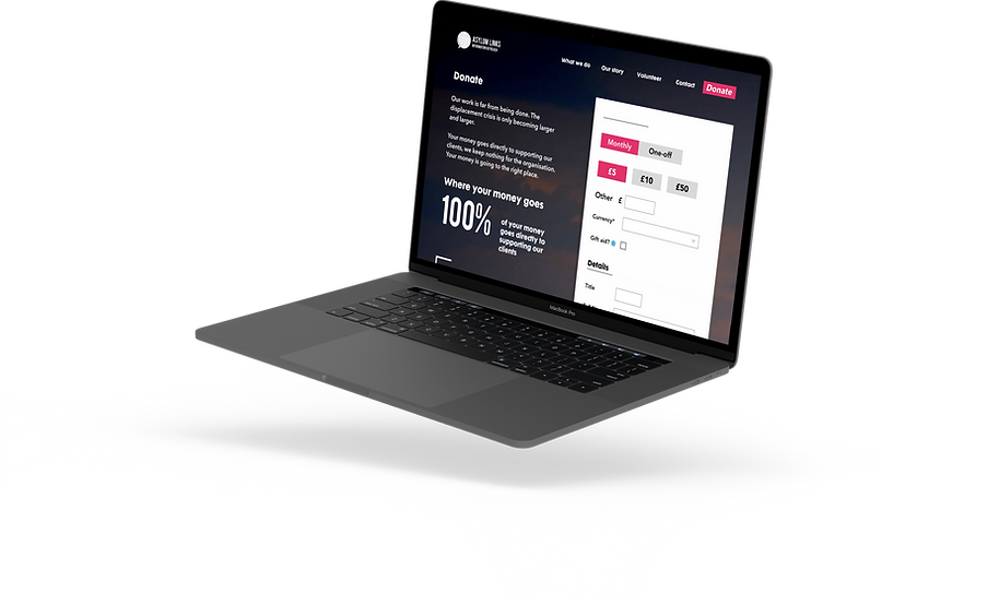
DESKTOP DESIGN

Brief
Scope 2 weeks (and lots of late nights)
Asylum Links Information Outreach is an aid organisation focusing on reaching refugees with their their most valuable and sadly, most underserved resource — information.
Their website needed to be doing more for them as an organisation and for the incredible work they were doing, they needed to be appealing more to a younger and more tech savvy audience.
The website they had previously been updating through Wordpress was outdated and was in serious need of an updated design to help them with their primary business objectives of the time - to gain more volunteers to join their cause and to gain donations and grants. In order to achieve this they needed a website that made them look far more legitimate and would incite confidence in both potential volunteers and potential donors within the cause.
Brief highlights
01. Inspire users to volunteer
02. Generate more donations
03. Appeal to a larger audience
04. Create a seamless social media ecosystem
05. Generate more traffic to the site
The Team
Product designer (me), and another product designer (my freelance partner).
My role: Though we shared the research and most of the design work between us, I primarily focused on the landing page, What we do, Campaign, and Volunteer with us pages.

Design process
Working with one other designer with bi-weekly updates to the main stakeholder, our first task was to gain a deeper understanding of the core decision making processes that users underwent when deciding to invest their time or money in a charity.
We wanted to talk to as many potential users as possible but given our limited scope, we time-scaled our research and planning down to only a few days. For this reason, I wanted to be as specific as possible about the types of people we would interview or survey.
We honed in on people who were already valiant volunteers and doners in the charity, as we wanted to understand what the deciding factors were for them and use that to inform our information architecture.
We had constructed a detailed heuristic analysis of the website; so further focused our questioning around the observed problem areas of the site so we could quickly ascertain key motivators for potential users and potential drop-off points.

Within a short scope (2 weeks), we gathered as many people as we could find to interview
There was an incredibly emotional, human element to the deciding factors to become volunteers. There was a definite sense that people wanted to feel empowered to help. They wanted to know that they could do something tangible when they witnessed human suffering.
With a clearer steer on our users, we began to construct some definitive user goals and some corresponding solutions that we could implement on the site.

We constructed strategy sheets for the business goals in order to ensure that we were on the right track in acknowledging them, so we began with these sheets in order to create more succinct feature lists.
We constructed a persona based on the volunteers that we had talked to.
Based on a lot of the contextual research that we had done into charity based websites we came across studies that concluded that the biggest problems that arose with the information architecture within charity websites were that they had to split focus into three different user types — the clients being helped, the donors, and the potential volunteers, and because of this many of them had a cluttered and unfocused website that we really wanted to avoid with Asylum Links.
Because of this we decided that the smartest path to take was to focus on one persona and encapsulate certain elements of the other persona (being the doner) and then have some clear calls to action throughout the site that would guide potential clients back to the Facebook page, in this way being able to focus our information architecture and have a clear vision for the site that wouldn’t make it cluttered or unfocused.

Our user persona's gathered from our interviews
Landscape analysis + Design
Our process was streamlined by our ability to detach meaningful design concepts to work from - something that I've applied to all future projects.
We concentrated our efforts particularly on the humanity behind the project. One of our user pain points was the so-called 'victimising' of the charities subjects, which users felt embedded an ever deeper divide between the volunteer and the cause.
We knew that to bridge this divide transparency and clarity were key - potential volunteers needed to know that they could make a direct impact, and donors needed to know that even their money could make a direct impact.
We did a relatively broad landscape analysis, looking at both the overall look, feel and features of other charities as well as specifically some of the journeys we wanted to improve on the website, such as Donation pages. I looked over 50 different websites and charities and condensed down what I felt were the best to help us draw inspiration.

Please excuse the typos, I was trying to eat at the same time
We started to plan out our designs through paper sketching, but I won't show that here. It wasn't pretty at this point, for which I can only blame the other designer - her handwriting is truly horrible.
We'd reconstructed the site maps and user flows at this point and were quickly running out of time to deliver the full project, keeping in mind that we were designing for both desktop and mobile, so we moved very swiftly into mid-fidelity mock ups which we hurriedly guerilla tested on whoever was willing.

Our mid fid designs that we used for user testing
User testing
We managed to get 4 users to test our mid-fid designs with.
2 x users sourced from our original interviews (ages 22 & 35)
2 x users sourced from our co-working space (ages 28 & 48)
In testing, we found that some of the issues arose were mostly centred around the clarity of what the organisation did in the first place so we knew that we had to make it much clearer to the user from the moment they arrived on the homepage.
Many of the issues that arose were also specifically to do with the copy and labelling — which we later spent some time developing for the sake of clarity.
Calls to action and the information prioritisation of these were also a factor — we moved the call to action to volunteer from the hero image at the top of the page and changed it to ‘About Us’ — it was incredibly important from our design specifications that the organisation was humanised and that the user felt an affinity to the people behind the project and not only the cause itself.
Final Product
You can view a video of the high-fidelity prototype we created down below. We handed over the designs to the main stakeholder in Sketch and Invision - as well as our detailed analysis of the charity's communication strategy. I feel we were able to detangle any huge issues within the first round of testing, all testing subjects felt that the design had greatly improved.
This was one of my all time favourite projects to work on. The people behind this charity are incredible, and so open to being interviewed for the sake of user research.
I feel the website we created could still be improved - the site architecture could be more efficient in encouraging volunteers, and there are significant UI changes that I would make.
Surprisingly, I think what was the most important facet of our work with Asylum Links was being able to construct a communication strategy for the organisation. Despite the new website still being in development, our client expressed that understanding the target users from our research will be instrumental in seeing the charity forward.
